Get ready to fall in love with...forms?!
Typeform Case Study
Check out how Typeform turned the boring chore of filling out forms into a delightful and interactive experience.
Opportunity:
Back in the day when online forms were a dime a dozen, Typeform had to stand out as the preferred form builder from dozens of options (Google Forms and co). Typeform approached this not by focusing on being a better form builder, but by focusing on delivering a better user experience.
Aha Experience:
Engaging Design
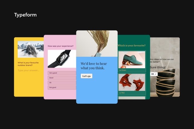
The first thing that stands out from Typeform's forms compared to others is how aesthetic they are. They use bold colors, playful animations, and a conversational tone that makes filling out forms more enticing and enjoyable. This feature benefits the creator of the form by incentivizing more and better responses. It also reflects better on the sender - it tethers the sender to a professional and developed brand rather than to a clunky and amateur company.
Conversational Experience
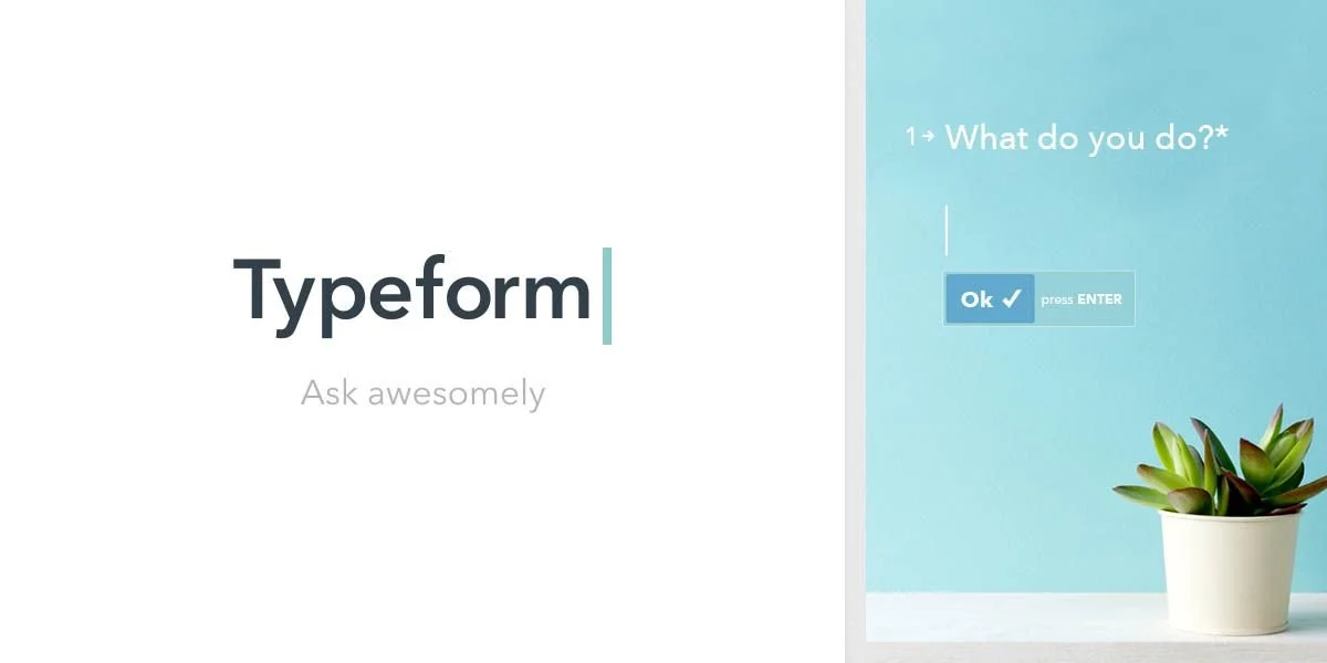
Typeform's designed their forms to be more like a conversation than a traditional human-less form. They show one question at a time and only reveal the next question once you’ve answered. This makes the transaction feel more personal and less overwhelming, resulting in a higher completion rate and more honest responses. And that’s the goal of any form builder, right?
Simple
Typeform's intuitive and conversational design, combined with its user-friendly interface, makes answering surveys and forms a breeze. The simplicity of the experience reduces frustration and makes it easy for users to complete forms, improving completion rates and data quality.
By creating an enjoyable and engaging experience, Typeform builds a positive association with the act of answering surveys, increasing the likelihood that users will return for future forms. This helps companies better understand their customers and make more informed decisions. Typeform says it best when they describe their product as “People-friendly forms and surveys.”
Outcome
Typeform's launch in 2013 disrupted the traditional survey experience with its user-centric design and conversational approach. Since then, Typeform has grown into a company valued at over $1B as the beloved survey and data collection platform of young startups and bluechip corporations alike.
Garrett’s Takeaways:
Humanize it. Typeform is a product for humans. They humanized their product by making it feel conversational rather than operational. Chances are, your experience is for humans too. So humanize it!
Make your customer the hero. Companies who use Typeform to send their surveys look elite thanks to the beautiful and professional-looking forms Typeform created. Find ways you can do the heavy lifting and make your customer look like a hero.
Best-in-class is profitable. Typeform competes against dozens of solid free survey tools, but they still generate hundreds of millions in revenue by offering an excellent experience.


